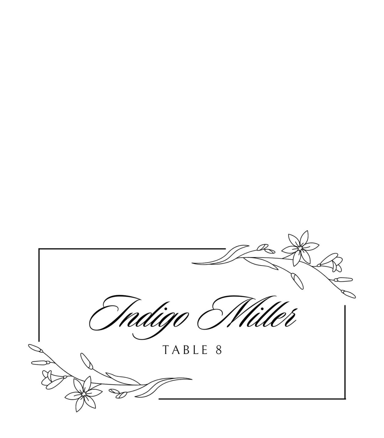
The Foundation of Elegance: Paper Stock and Printing
The first step to creating a professional place card is to select the right paper stock. A high-quality, smooth paper with a subtle sheen, such as a premium card stock, can elevate the overall appearance of your place cards. Consider the weight of the paper as well. A heavier stock will feel more substantial and luxurious.
When it comes to printing, opt for a high-resolution printer or a professional printing service. Ensure that the ink is of high quality and the colors are vibrant. Laser printing is often preferred for its crisp lines and durability.

Image Source: canva.com
Design Principles for Professionalism
Typography:
The choice of typography is crucial in conveying professionalism. Serifs fonts, such as Times New Roman or Garamond, are classic and elegant choices. Sans-serif fonts, like Helvetica or Arial, offer a more modern and minimalist look.
Ensure that the font size is legible, especially for older guests. A clear and easy-to-read font will enhance the overall experience. Avoid overly decorative or playful fonts, as they may detract from the formal atmosphere.
Color Palette:
A well-chosen color palette can significantly impact the perceived professionalism of your place cards. Classic color combinations, such as black and white, gold and silver, or navy and gold, are timeless and sophisticated.
If you prefer a more modern look, consider using a monochromatic color scheme or a combination of complementary colors. Remember to use colors that are easy on the eyes and that complement the overall theme of your event.
Layout and Spacing:
A clean and well-organized layout is essential for professional-looking place cards. The information should be easy to read and visually appealing. Use ample white space to create a sense of balance and avoid overcrowding the design.
The placement of the guest’s name should be the focal point of the card. Consider using a larger font size or bolding the name to draw attention. The other information, such as the table number or seating arrangement, can be placed below the name in a smaller font size.
Essential Elements of a Professional Place Card
Guest Name:
The most important element of a place card is the guest’s name. It should be clearly and prominently displayed.
If you’re using a numbered seating arrangement, the table number should be included on the place card.
If you have guests with specific dietary needs, you may want to include this information on the place card.
Depending on the formality of your event, you may also include additional information, such as a welcome message or a personalized greeting.
Tips for Creating a 6-Per-Sheet Template
Utilize a Design Software:
A design software like Adobe InDesign or Canva can help you create a professional-looking template. These tools offer a variety of templates, fonts, and design elements.
You can choose between portrait or landscape orientation for your template. Portrait orientation is often used for more traditional place cards, while landscape orientation can be used for a more modern look.
To maximize space and ensure efficient printing, carefully plan the layout of your place cards. Consider the size of the font, the spacing between elements, and the overall design.
Before printing a large quantity of place cards, print a test sheet to ensure that the layout, font size, and color are correct. This will help you avoid any last-minute surprises.
By following these guidelines and using a well-designed template, you can create professional place cards that will impress your guests and elevate the overall ambiance of your event.