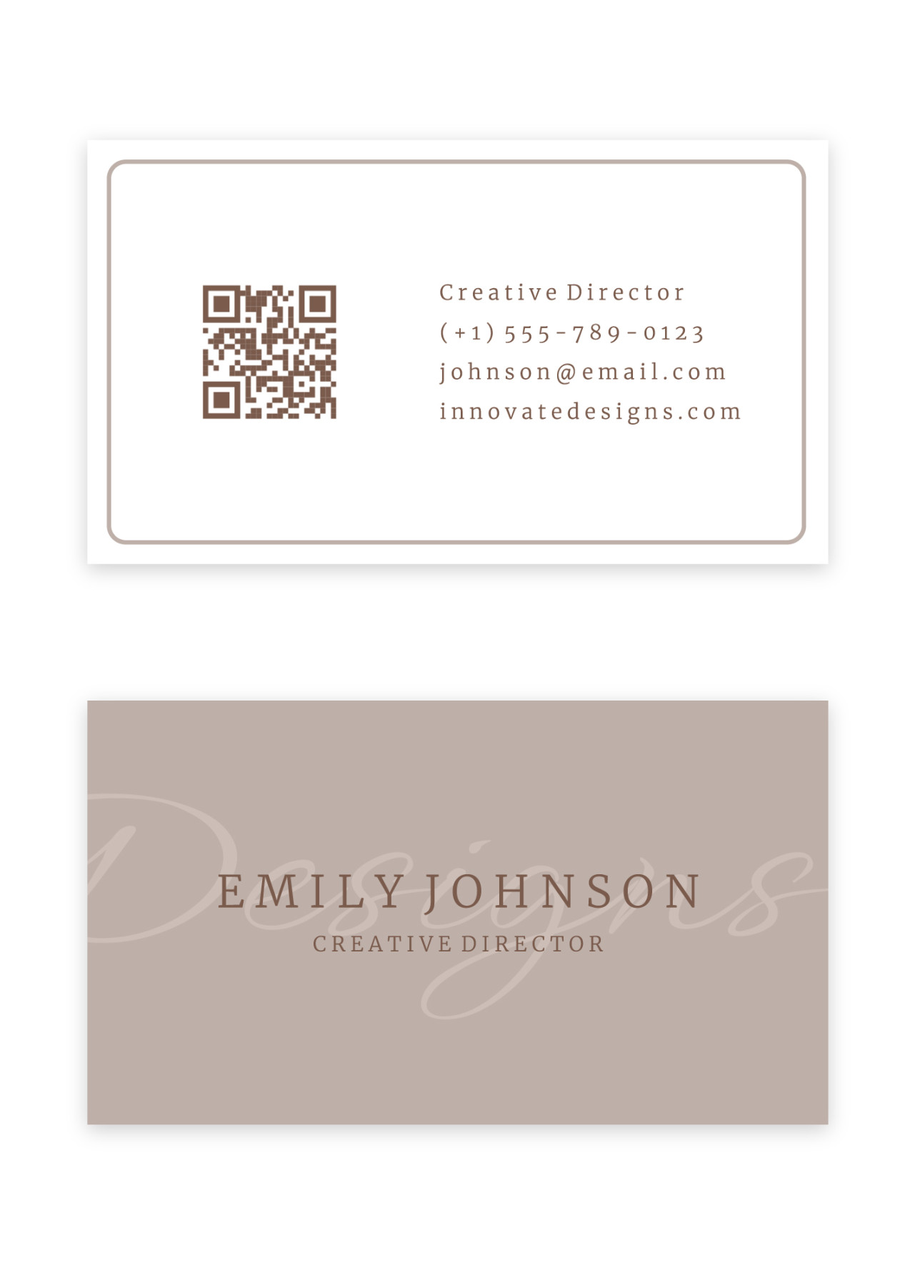
Understanding the Canvas
The first step to creating a professional business card template in Google Docs is to understand the canvas. This is the digital space where you’ll design your card. Google Docs provides a flexible and intuitive interface for this purpose.
Setting the Stage: Dimensions and Margins

Image Source: gdoc.io
Dimensions: Standard business card dimensions are 3.5 inches by 2 inches. Ensure your Google Doc is set to these exact measurements.
Typography: The Voice of Your Brand
Typography is more than just font selection. It’s the visual voice of your brand.
Font Choice: Opt for fonts that are clean, legible, and professional. Classic choices like Times New Roman, Arial, or Helvetica are reliable. However, don’t shy away from modern fonts that convey a sense of innovation.
Color Palette: A Visual Language
The color palette you choose can significantly impact the overall impression of your business card.
Brand Colors: If you have established brand colors, use them consistently throughout the design.
Layout and Organization
A well-organized layout is essential for a professional business card.
Name and Title: This information should be the most prominent on the card. Place it at the top, using a larger font size and bold weight.
Visual Elements: Elevating the Design
Lines and Shapes: Use subtle lines and shapes to divide sections or create visual interest.
Proofreading and Testing
Before finalizing your design, proofread carefully for any typos or errors.
Print Test: Print a few copies of your business card to assess the final look and feel. Check for color accuracy and overall print quality.
By following these guidelines, you can create a professional business card template in Google Docs that reflects your brand identity and leaves a lasting impression. Remember, the key to a great business card is simplicity, clarity, and a touch of creativity.